

There are still five years to go until Japan hosts the Olympics in 2020, but preparations have already been mired by setbacks and controversy. First billions of yen were poured into designs for a new stadium, only for the plans to be completely scrapped when costs continued to exceed the initial budget.
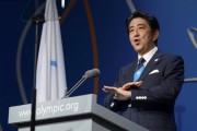
Then last month, a Belgian theater director claimed that the Tokyo Olympics logo was stolen from a design he made in 2013. Sano Kenjiro, the Olympic logo’s designer, denied the claims and Japan’s Olympic Committee stated that it plans to go ahead and use Sano’s design. But the controversy continues to grow as new allegations emerge that some of Sano’s other works were also plagiarized, such as this design for a zoo in Nagoya.
Sano now faces yet another plagiarism claim as an art museum in Gunma Prefecture says it is currently investigating the logo Sano had designed for them to determine whether or not it was plagiarized from another source.
On 2ch, netizens did some investigating of their own and found several designs that bore a strong resemblance to Sano’s, leading to further debate about whether or not Sano is a serial plagiarist.
From Jomo News:
“City Officials Investigate Sano’s Design for Museum Under Construction
Ota City officials are investigating whether or not the logo for the “Ota BITO Art Museum and Library” which is currently being built at the north exit of Tobu Oota Station is an imitation since Sano Kenjiro, who designed the 2020 Tokyo Olympic emblem, was responsible for its creation. It’s unlikely that the logo, which displays the word “BITO” alphabetically, is a knock-off but officials will conduct the investigation “as a precautionary measure”. The investigation will be entrusted to a specialist by an external patent attorney.
Was Josh Divine’s design (right) more than just the inspiration for Sano’s design (left)?
Comments from 2ch:
シューティングスタープレス(愛知県)@\(^o^)/:
Could this be the original source?
Dot-logo, a textile design company: http://m2.behance.net/rendition/pm/1461763/disp/1991af3199c522eaa87fb9714ef7eb7e.jpg
http://joshdivine.com/12471/177118/gallery/dot-logo
Or what about Bobobobo, an Indonesian travel agency?:
http://www.startupjobs.asia/images/company/400/29623-Bobobobo-Logo-with-Address-new.png
http://id.startupjobs.asia/id/job/7965-operations-executive-corporate-support-bobobobo-indonesia
エルボーバット(新疆ウイグル自治区)@\(^o^)/:
It’s a complete rip-off w
膝靭帯固め(空)@\(^o^)/ :
The first and third images are identical
バズソーキック(神奈川県)@\(^o^)/:
Why is the B capitalized?
It kinda looks like a bra.
バズソーキック(神奈川県)@\(^o^)/:
What is up with this logo? www
男色ドライバー(dion軍)@\(^o^)/:
Whether or not this was plagiarism, if someone came in with a design like this I’d immediately reject it w
腕ひしぎ十字固め(大阪府)@\(^o^)/:
There’s honestly no consistency in these designs.
パイルドライバー(兵庫県)@\(^o^)/:
This isn’t a design so much as font plagiarism.
Sano was much too careless.
フェイスロック(庭)@\(^o^)/ :
Daaaamn… this is plagiarism, plain and simple
ときめきメモリアル(静岡県)@\(^o^)/:
The amazing thing about this guy is that in terms of design he does nothing that surpasses the original. But I’m sure he’ll be able to get away with it by saying something about how he was so inspired by the original.
ファイヤーバードスプラッシュ(西日本)@\(^o^)/:
If this is what passes for OK then maybe even I can become a designer.
All I need to do is do a Google search and then make something similar, right?
ファイヤーボールスプラッシュ(関東・甲信越)@\(^o^)/:
Unfortunately you won’t get anywhere without connections w
ダブルニードロップ(関東地方)@\(^o^)/:
The sheer number of rip-offs this guy has made is ridiculous www
ダイビングエルボードロップ(SB-iPhone)@\(^o^)/ :
Even putting aside the issue of plagiarism, this is awful. Are you telling me the client was OK with this?
イス攻撃(SB-iPhone)@\(^o^)/:
In terms of design, this thing is a mess. The O looks like a lower case letter.
アンクルホールド(長野県)@\(^o^)/:
They should investigate the company or organization that requested this schmuck to make the logo.
ツームストンパイルドライバー(庭)@\(^o^)/:
This just doesn’t end, does it? w
毒霧(SB-iPhone)@\(^o^)/:
This one is a rip-off too? w
There are hardly any that aren’t plagiarized…
頭突き(やわらか銀行)@\(^o^)/:
How many tens of millions of yen did the city pay for this? Are they stupid?
ストマッククロー(SB-iPhone)@\(^o^)/:
Before we even get to the issue of plagiarism, the balance of the capital B in this design is just awful.
I feel sick looking at it.
This guy truly has no taste.
